January 15, 2025
The beauty of goofy diagrams
Discuss this article on Hacker News.
A few days ago I was writing an article for my blog. A friend looked at my screen, and looking at a diagram I made, said “I’m… a bit surprised. It doesn’t look like you”.
The comment was not mean in any way, it was genuine surprise. I indeed tend to like sober design in general (btw, Hacker News designers: you’re the best ❤️).
The thing is, I’m more and more convinced that the style of a presentation matters. Even before looking at the content itself, the style puts you in a particular mood.
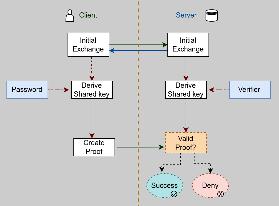
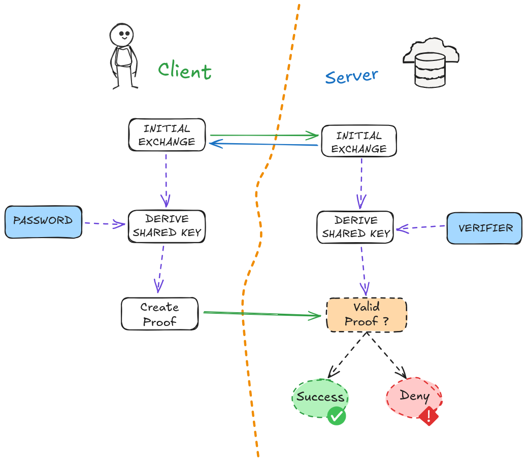
Let’s look at these examples.


How do you feel when quickly looking at these diagrams?
To me, although they convey the same content, the first one creates a sense of seriousness and gravity. It feels like only clever people can understand it. I’m already a bit tense and I feel like I need to focus. I almost take a deep breath and say to myself “okay, you can do it”. I feel dumb but I feel that with enough curiosity and hard work I can understand the content.
The second one, on the other hand, makes me feel more relaxed and probably more curious. The topic seems easier to grasp and I’m quite confident I can understand it. It doesn’t mean it brings more clarity: the first diagram is actually probably clearer but the content has more chance of reaching my brain with the second one because I’m more open to it.
I already experienced the way content is presented impacts my learning abilities. As a university student, I discovered the book Use Your Head by Tony Buzan. It taught me to have fun while writing down my course: drawing things (even the most stupid things that could help me remember something: I could draw a friend of mine or a dish if they personally reminded me of the specific topic somehow), using garish colours, making some concepts and titles HUGE, placing my page in landscape mode to make a mind map (some students looked over my shoulder in a weird way).
I won’t do here the “thanks to my disruptive strategy I ended up top of my class” bullshit. I was not a bad student and I had fun learning and remembering new things. I think it’s already positive. I still remember some parts of mind maps and drawings about sociology I made 12 years ago. Not everything obviously, but some of them.
I also remember when I found a book from the series Head First, published by O’Reilly: a book about XHTML (I know, I’m getting old). The content was not that great I think, but I loved the approach and the tone. For someone self-taught like myself, having access to learning material which showed things with humour and in a non-linear/exciting way was a blessing. Although I never took a CS course, I knew I could learn things and become good at it. This is also what makes Julia Evans drawings so amazing.
I might be wrong, but I do think it’s one of the (many) reasons why tech influencers like The Primeagen or Theo - t3 .gg are successful. Their frequent use of hand-written-looking diagrams (on top of their teaching skills) gives a particular vibe to their content. I don’t feel dumb when I look at these. I feel relaxed and confident in my ability to grasp new concepts. I won’t pretend that it works for everyone, but I’m sure I’m not the only one.
You should obviously adapt the style to your goal and context. Sometimes being understood by a majority of people is not the main focus: looking serious, competent, and reliable is good too (writing in Comic Sans MS your research paper or a resume for a job in a Minister is probably not the best idea).
But you want to teach things? Don’t be afraid to look goofy.
The world probably needs more goofy diagrams.
Update: I was told my comparison between the two diagrams was not fair. The first version of the “serious” diagram had no colors, icons or arrow types. I agree. Fixed.
* The first diagram is a heavy copy of the one found on this page.
Discuss this article on Hacker News.